A Re-Imagining of the Uber Eats User Experience — A UX Case Study

Project Overview
Goal: Uncover prevalent user issues for the Uber Eats app that would give the company an edge over its competitors.
Impact: I created a feature on the Uber Eats mobile application called the “Grace Period”. Users are given 5-minutes to edit or cancel their order after a purchase has been sent through to the restaurant.
Role: UX Designer — worked in collaboration with 3 other Jr. UX Designers
Timeline: 8-week digital mobile solution
Methods: Competitor Analysis, User Interviews, Affinity Mapping, User Persona, User Journey Maps, User Flow, Sketching, and Wireframing.

The Problem
My “Where”
Where does one begin to look for user issues of Uber Eats when it is the top Food delivery service in the world. Uber Eats is available in over 6000 cities across 45 countries worldwide and continues to expand its outreach. Uber Eats must be doing everything right to have that kind of traction. Nevertheless, if you're at the top of your game, you must continually keep an eye on your competitors and be two steps ahead.
In Canada, the top food delivery services are Uber Eats, Doordash and Skip the Dishes. I conducted a competitor analysis in figure 1. using the following criteria:

Takeaways
After examining all 3 companies, I realized what Uber Eats was missing following (Figure 2):

My “Why”
Why should Uber Eats even care about this?
Let me give you the big picture — There are two needs:
- The Business Need
There is a business need for customer retention & assisting customers, but it needs to be done cost-effectively.
2. The User Need
There is a user need for an experience that is transparent, giving users more control for error prevention.
Considering these two factors will, in turn, lead to improving customer support for better user control, freedom & satisfaction.
How might we fine-tune aspects of customer service to resolve unique user issues?

User Research
My “How”
Before executing a UX Project, planning and preparing are essential. Having a plan allowed for my teammates to be on the same page and no one was in the dark when it came to how the interviews were going to run.
User Interviews
Data compiled by 4 UX researchers and collectively pooled from a total of 8 Interviewees.
- Target Audience: young adults/students born in Gen Z generation (age range 20–35)
- Hypothesis: users could benefit from an extra support screen after an order is placed
Discussion Guide
The guide consisted of unbiased, open-ended interview questions regarding the current Uber Eats user experience and customer support options.
- 5 main research questions
- 30-minute interviews conducted remotely
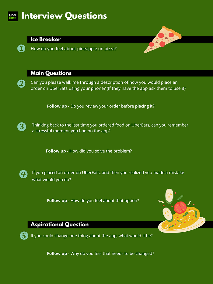
Going over my interview notes, I realized there were golden nuggets of information that my participants provided, however, I wish I was able to acknowledge them at the moment and explore them further with better follow-up questions.
I learned that most of the information a participant provides isn’t always insightful, which is why it’s extremely important how I frame follow-up questions to get participants to dig deeper into their own thinking.
What did I find?
From these interviews, I gained qualitative insights (figure 5) into the current experience Uber Eats users face on the app. From there, to understand them better, my team and I went about synthesizing the data around high-level takeaways capturing pain points, behaviours and motivations (Figure 4).
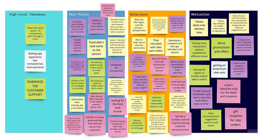
Assessing our collective data we found common themes and formed them into questions:
What is the current return process and what should it be?
What is the current Help Area and what should it be instead?
What if I get into Help but cannot contact the driver? Then what?
How can the contact centre do better?
Is there a way to replace the contact centre with a better design
What is the current order-change process? How can it be better?
What is the current address-change process? How can it be better?
From the questions above our main focus moving forward was awarded to:
- Replacing the contact centre (we didn’t pursue this in the end)
- Order-change process
- Address-change process


Who did I meet?
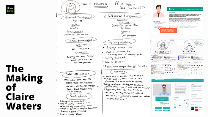
Our primary persona — Claire Waters. By acknowledging the responses from our user interviews, we created our own personas (Figure 6) and blended them to create our primary persona, Claire Waters (Figure 7). We chose to form a persona as a way for us to involve ourselves in her experiences as we set out to design for her.

What is her experience?
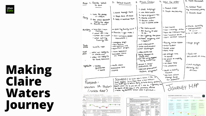
After synthesizing our interview findings, our team was able to form a customer journey map for Claire to track a one-path journey on Uber Eats (Figure 8 & Figure 9). The map reflects her experience when an order mistake has been made. As Claire goes along the journey her mood procedures decline as her need for customer support post-order is not met.
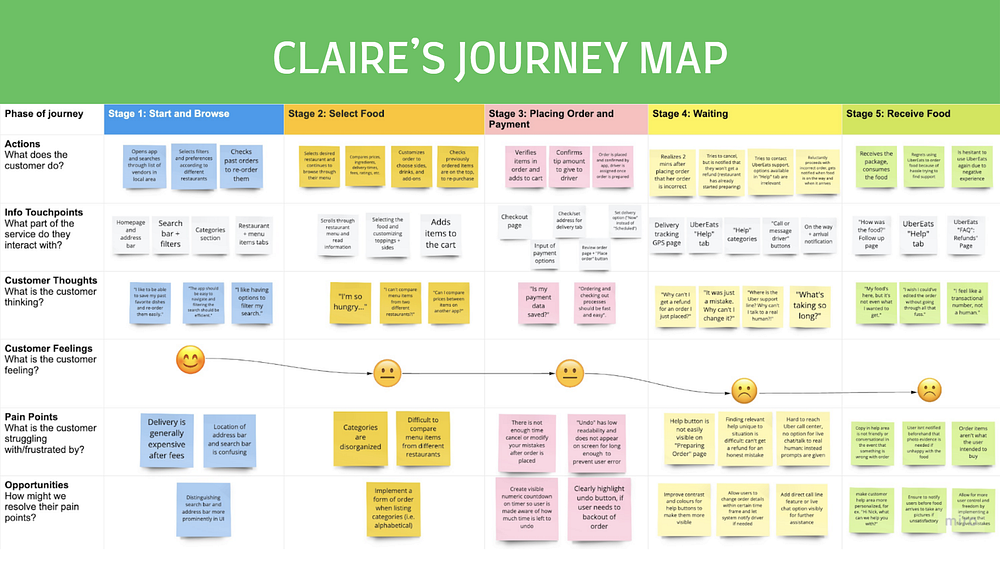
Going back to our problem statement, we began this process intending to find a better solution for the current customer-supportive features on Uber Eats. In hopes that it would provide users with a transparent experience that would give them more control for error prevention. We investigated the problem and got meaningful insights; we analyzed and synthesized the qualitative data. I asked myself Why and How, and it led me to My What.

Solution
My “What”
What do I plan to deliver? (Pun intended). The proposed solution is based on user research (figure 10):

Ideation
Now that we understand Claire’s desires I can focus on the ideation. To further answer My What, I turned Claire’s desire’s into a primary task flow (Figure 12) that would guide a more concrete idea of how the Uber Eats application would meet her needs. The task breakdown shows the options available to Claire if she were to choose to cancel or edit her order after the purchase.
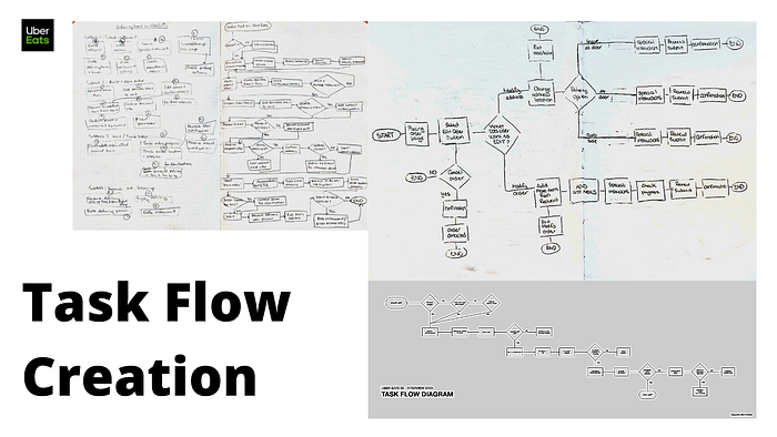

From this, I was able to draw out some low-fidelity sketches that would allow me to test if my designs would make Claire’s experience of editing/modifying or cancelling her order as easy as possible with no fuss.

Design Solution: Grace Period Edit Feature
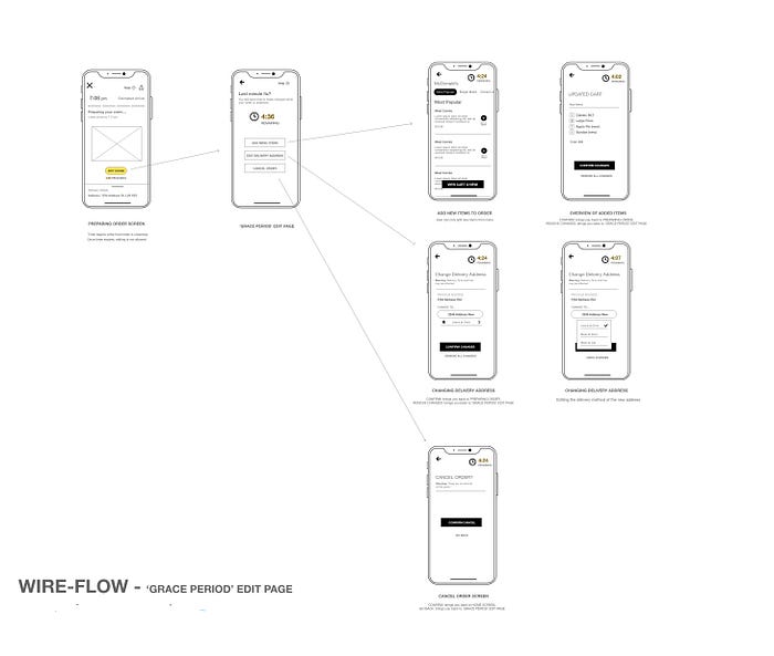
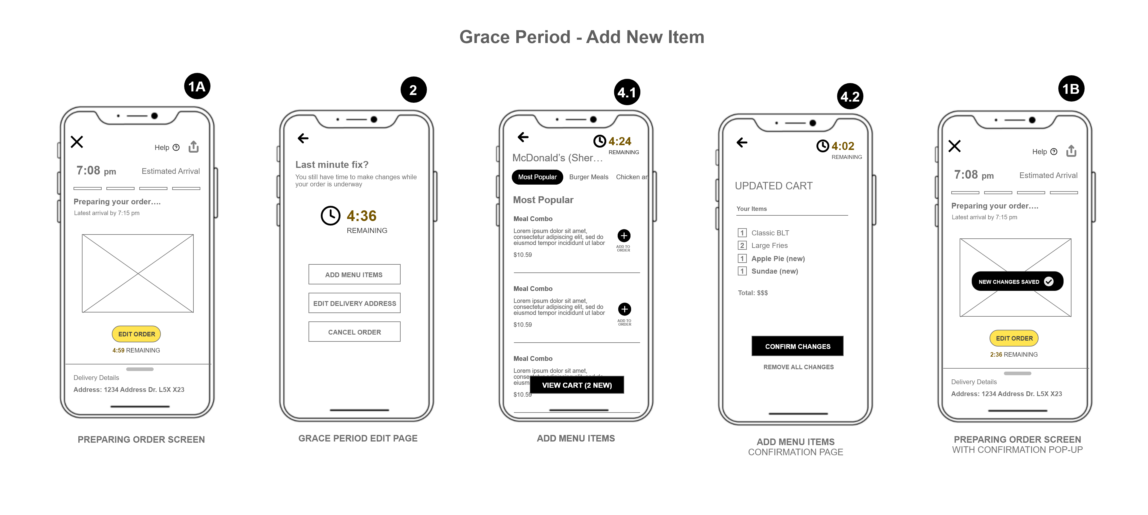
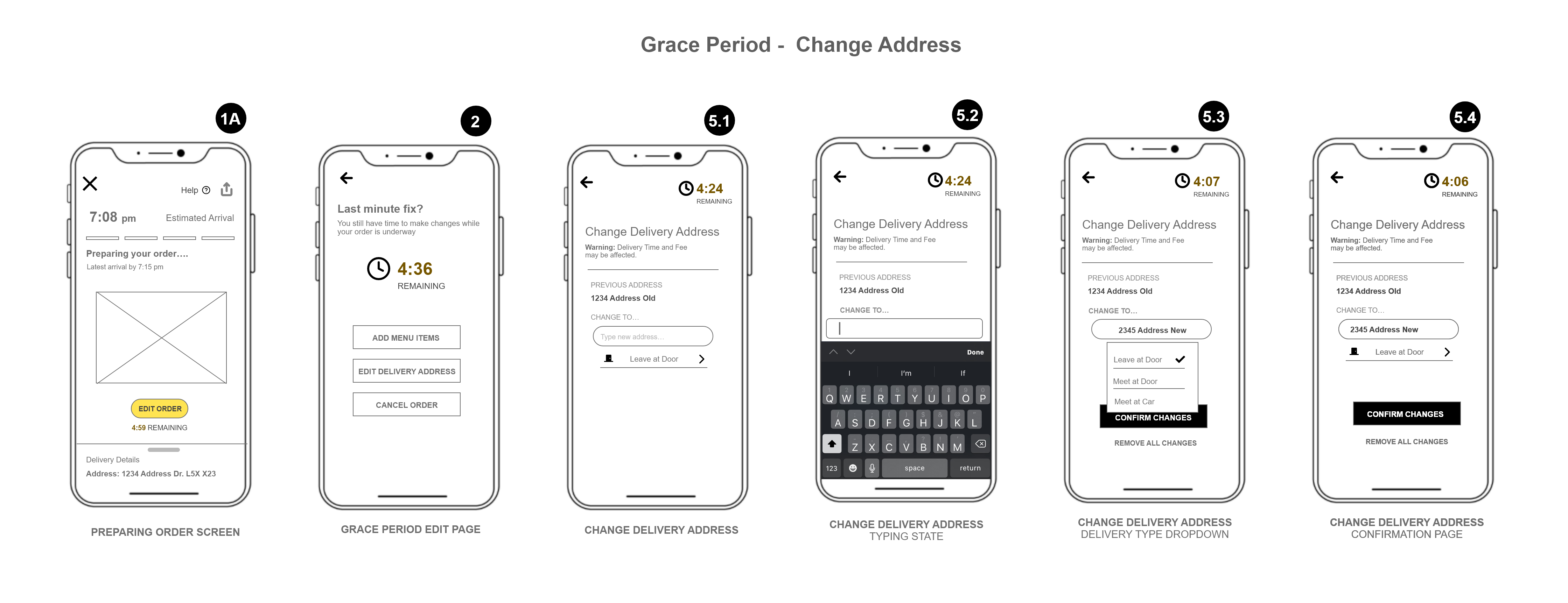
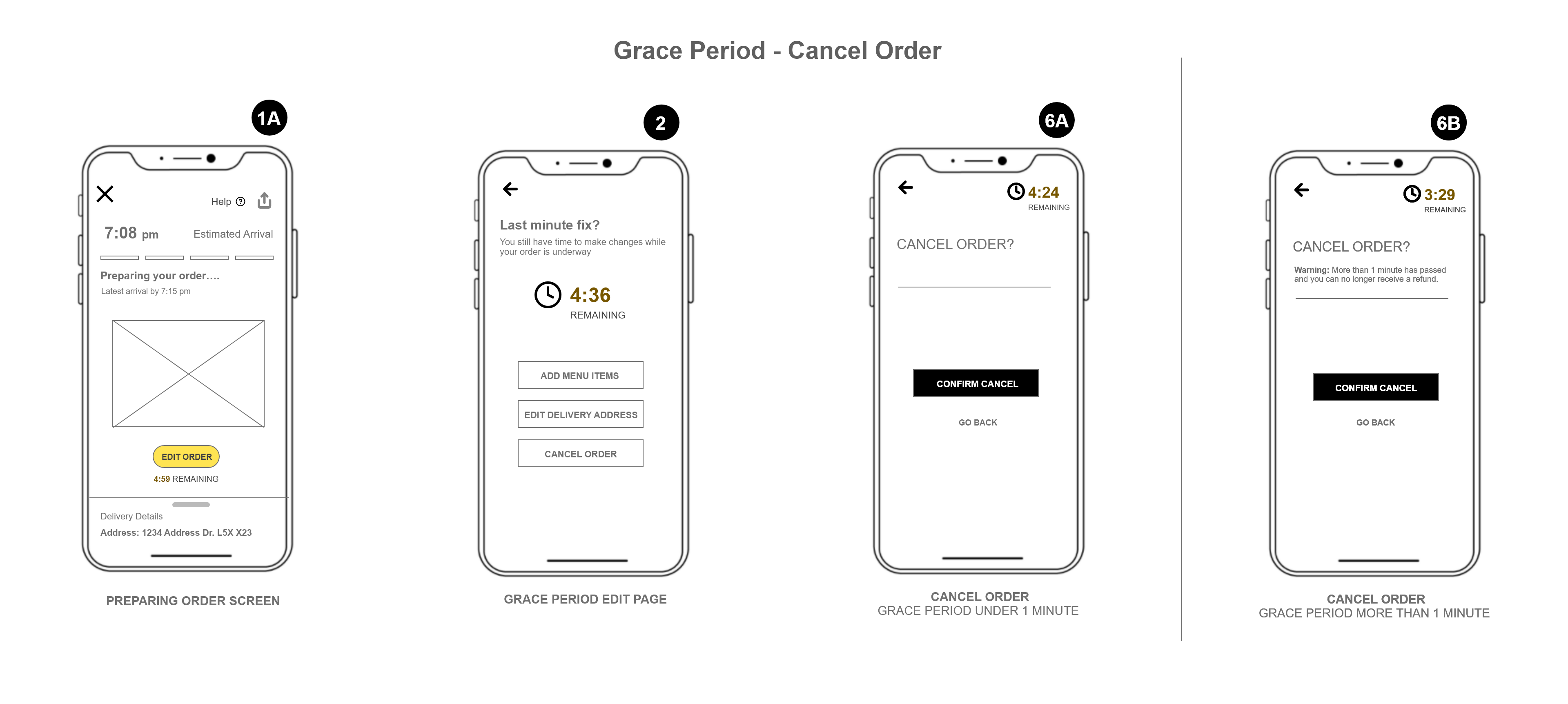
We designed a 5-minute timer on the “placing order” page. The idea is that the order is sent through to the restaurant, however, the user is given 5 minutes (i.e., Grace Period) to make changes to their order. Prior, Uber Eats only gave the user about 15 seconds to decide to cancel or make changes depending on how long it took the restaurant to accept the order.
During the Grace Period, the user is allowed to
a) Add new menu items
b) Change delivery address, or
c) Cancel the order
- Refunds are no longer offered after 1 minute has passed on the timer
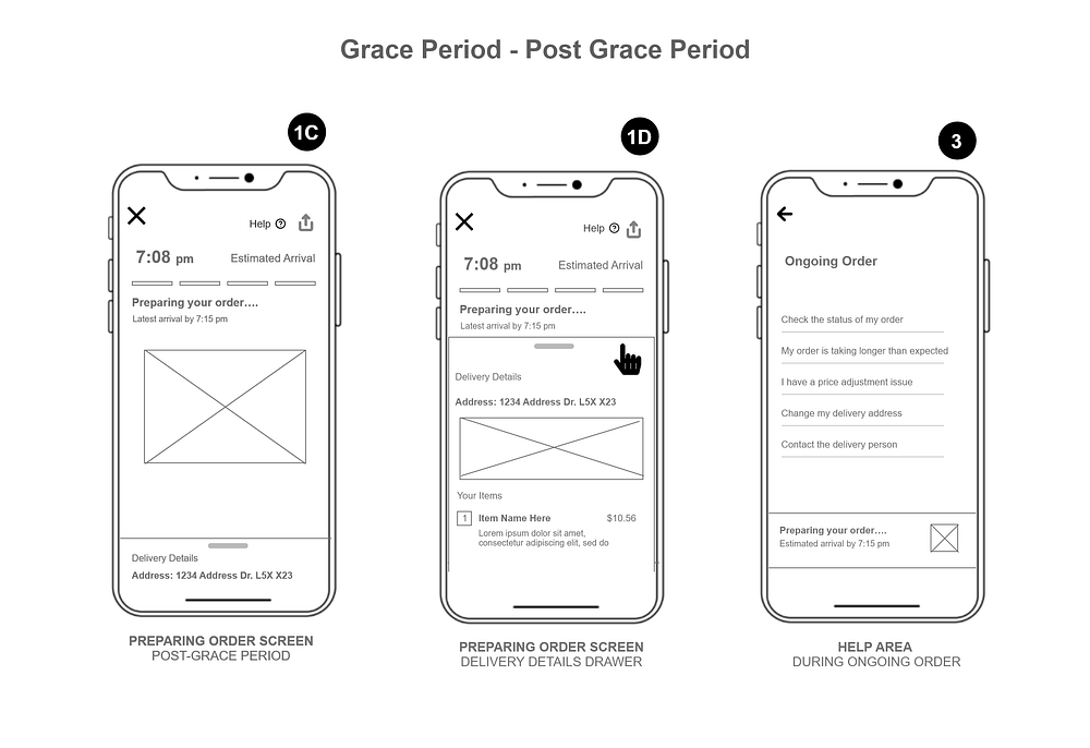
Once the timer expires, help options are still available to the user if extra assistance is needed
Wireframes
Using the primary task flow and our alternative sketches we collaboratively created high-fidelity wireflows for the Uber Eats — Grace period feature using Adobe XD (figure 14).
Multiple changes were made to the wireflow before we reach our final design (figure 15):
We found that having 7 screens wasn’t enough and we thought it would be best for additional screens along with micro-interactions for further detail.
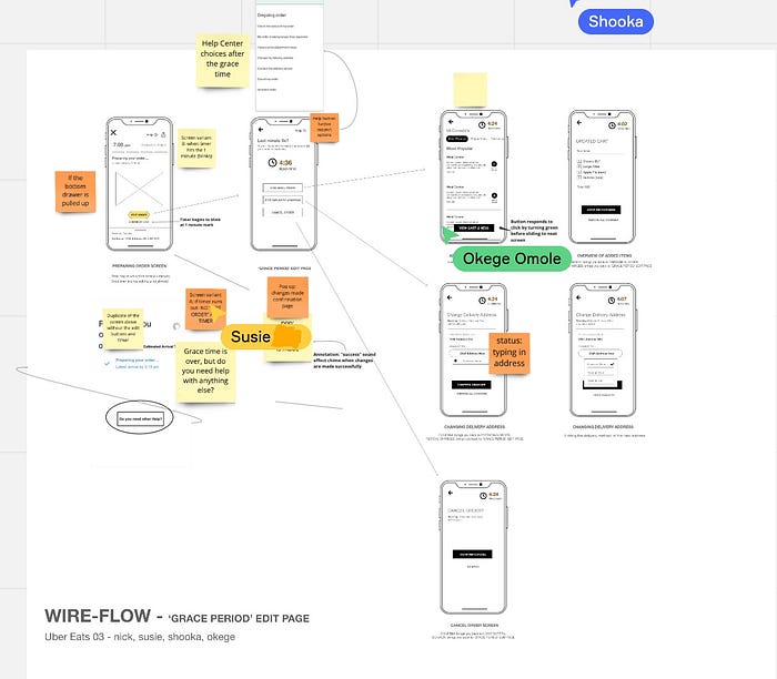
After collaborating on ideas, our final product went from 7 screens to 14 screens in total (figure 16).

A Closer Look
How does it work?
Here is a video of me breaking down how the Grace Period feature would work in different scenarios that our persona Claire Waters could go through.

Conclusion
Based on our research, we proposed design solutions that we believe will improve the overall user experience of Uber Eats. Our goal was to identify an aspect of customer service that we could fine-tune for an increase in customer satisfaction and our design propositions addressed those concerns.
The objective is to continue to demonstrate how Uber Eats can continue to be the top food delivery service. The functionality, usability and accessibility of the app should continue to be monitored and improved upon even in future iterations.
Next steps:
Our next steps following this point would be to test our design solutions with users to get immediate feedback, before moving on to higher fidelity prototypes.
What I learned:
- The importance of a competitor analysis! My constraint is not being able to talk to Uber Eats stakeholders to get a grasp of the companies needs, therefore a competitor analysis helped me see current business- and user issues. This allows me to start to form ideas of where I’d want to poke around when I do primary research.
- Before executing a UX Project, planning and preparing are essential. Having a plan allowed for my teammates to be on the same page and no one was in the dark when it came to how the interviews were going to run.
- I learned that most of the information an interview participant provides isn’t always insightful, which is why it’s extremely important how I frame follow-up questions to get participants to dig deeper into their own thinking.
- Collaboration is key! Teamwork makes the dream work! I had so much fun with my team, couldn't ask for anyone else.
If you enjoyed my story, feel free to connect with me on LinkedIn. I’m open to new opportunities in the design world. I can also talk about plants and TV shows all day so feel free to chat.
